Personal Injury Law Firm Website Design: What Actually Converts
By Brittany Winters, Director of Client Relations

A personal injury website has one job: turn a scared, hurting visitor into a call or a form fill. What converts is not decoration. It is a specific headline, a phone number and form above the fold, proof in real numbers, a mobile layout built for the thumb, a short form, and a page ordered as a conversion path. Design each of those on purpose and the same traffic signs more cases.
A personal injury website has one job: turn a scared, hurting visitor into a phone call or a form fill. Most law firm sites fail at it, not because they are ugly, but because they bury the one thing the visitor came for. Good design here is not decoration. It is the difference between a site that signs cases and a brochure that just sits there while your ad spend leaks away. Below is what actually converts, with a mockup of each piece.
The first screen decides everything
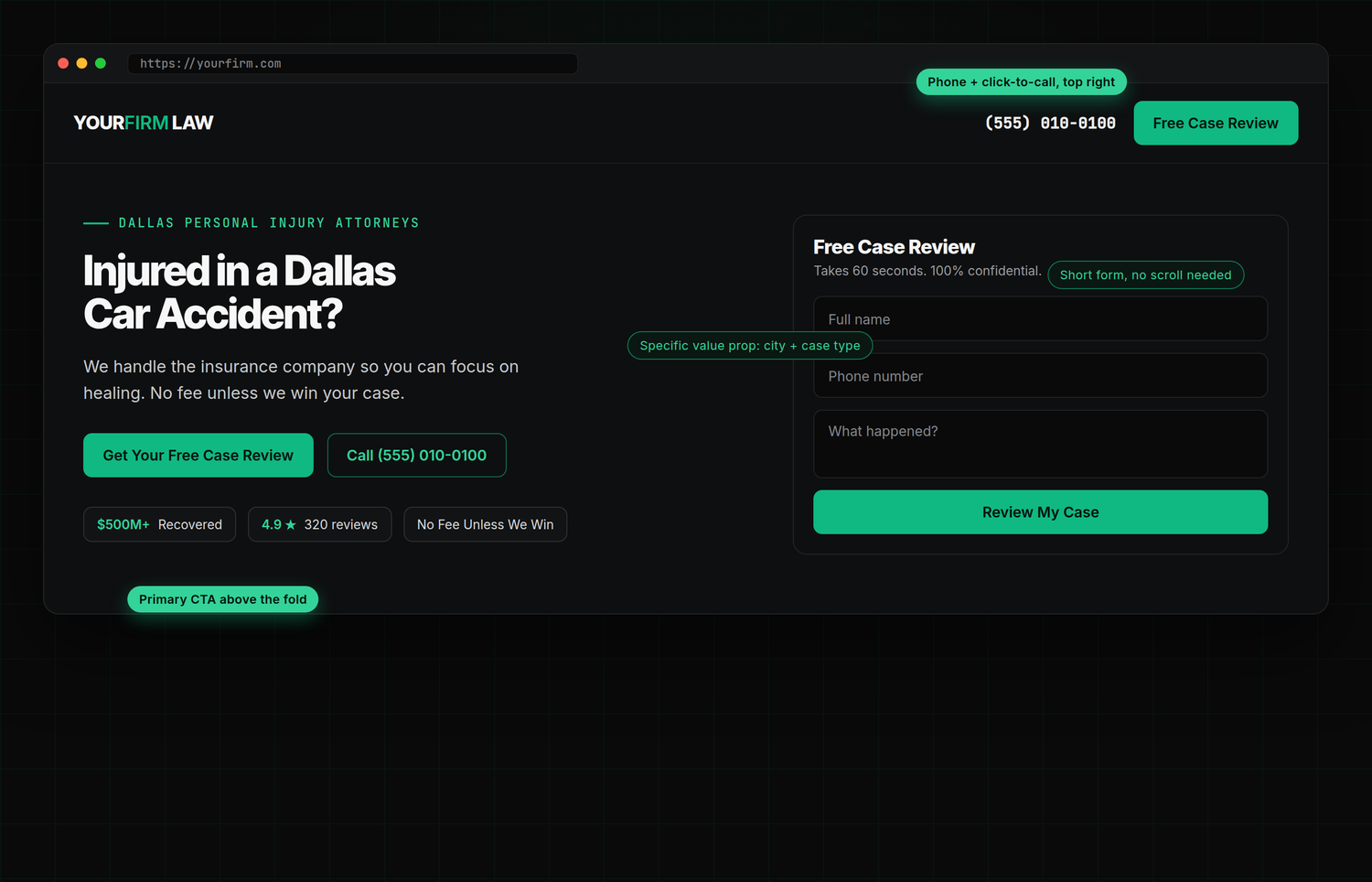
Before a visitor reads a full sentence, they have already judged you; research on web first impressions clocks it at around 50 milliseconds. On a personal injury site the first screen, the "above the fold" area a visitor sees without scrolling, has to answer one question fast: can these people help someone like me? That means a specific headline, a phone number they can tap, and a way to reach out without scrolling at all.
Lead with a specific promise, not your logo
The most common mistake is a hero that says "Welcome to the Law Offices of..." over a stock photo of a gavel. That tells the visitor nothing. The firms that convert lead with the visitor's situation: "Injured in a Dallas car accident?" plus a one-line promise like "No fee unless we win." It mirrors how injured people actually choose a lawyer, which is by quickly deciding who understands their specific problem. Name the city and the case type, because specificity reads as competence.
Design for the thumb, because most of your visitors are on a phone
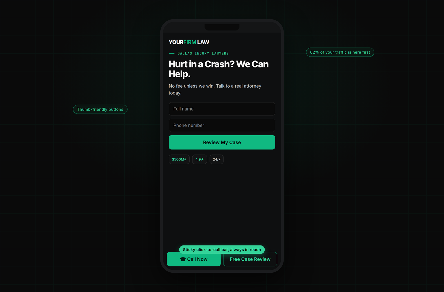
With 62% of law firm traffic on mobile, the phone layout is not the "smaller version" of your site. It is the main version. That means a tap-to-call phone number, thumb-sized buttons, and a sticky bar pinned to the bottom of the screen so the call and the form are always one tap away, no matter how far the visitor has scrolled.
Prove it with numbers, not adjectives
Every firm says it is "aggressive," "trusted," and "experienced." Those words are invisible because everyone uses them. Numbers are not. A trust bar with dollars recovered, a real star rating and review count, years in practice, and the no-fee promise does more work than a paragraph of adjectives, and it feeds the same proof signals that help your reviews and reputation carry weight.

Show real results, handled compliantly
Case results are the strongest proof a personal injury firm has, so give them a dedicated, scannable module: the amount, the case type, and a short line of context. Just remember these are regulated, so keep the required disclaimer visible and follow the rules for marketing case results and verdicts compliantly.

Make the form feel like the easy part
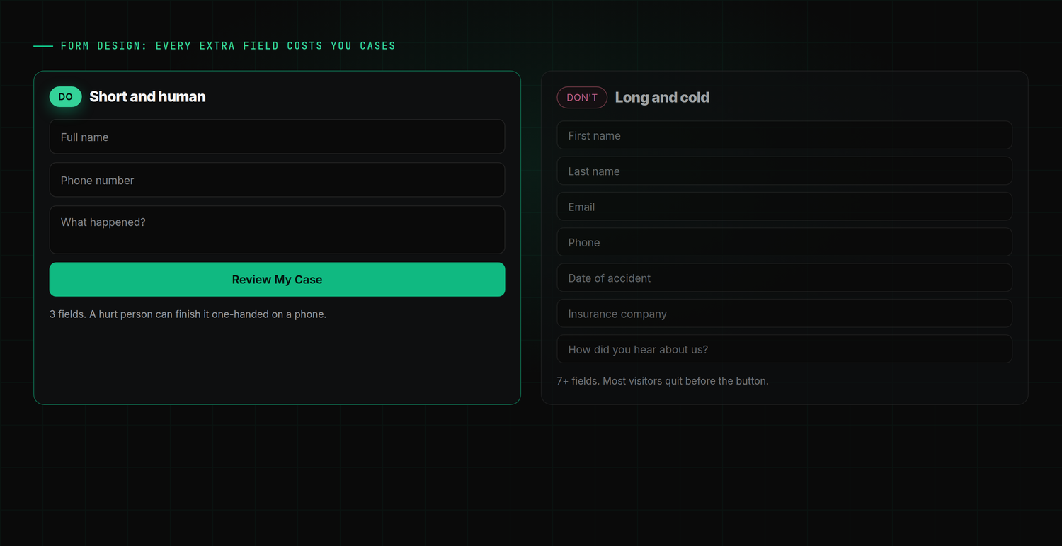
Every field you add is another reason to quit. A hurt person filling out your form one-handed on a phone does not want to supply their insurance company and date of loss before they have even spoken to you. Ask for the minimum (name, phone, and a short "what happened"), and gather the rest on the intake call. Short forms convert; long forms filter people out before you ever get to talk to them.
Order the page as a conversion path
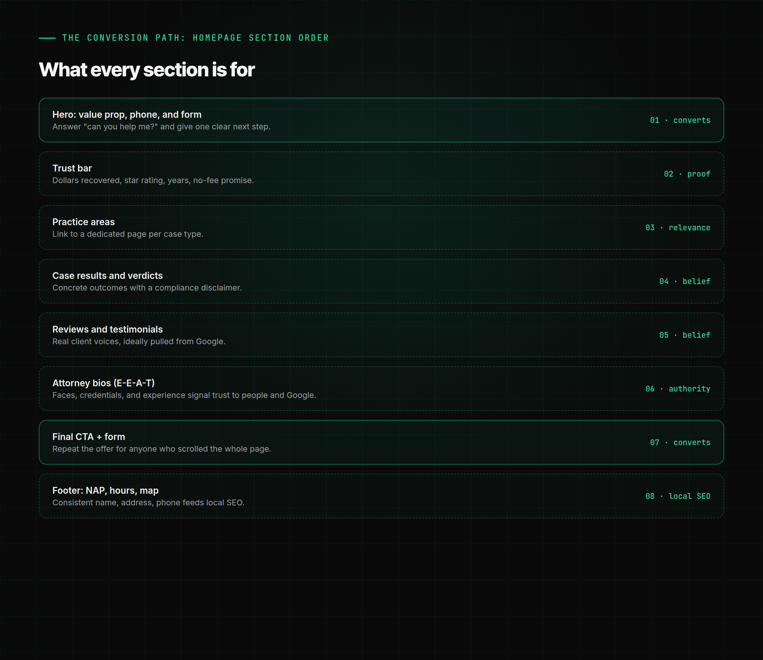
A homepage is not a list of sections; it is a sequence that walks a visitor from "can you help me?" to "I called." Each block has a job: the hero converts, the trust bar and results build belief, case-type links add relevance, attorney bios supply the experience and expertise signals that reassure both people and Google, and a repeated call to action catches anyone who read the whole page. The footer's consistent name, address, and phone quietly feeds your local SEO.
Speed and trust are design decisions too
Design is not only layout. A page that takes longer than 3 seconds to load loses more than half its mobile visitors before they see any of the above, which is why Core Web Vitals and site speed are a conversion issue, not just a technical one. The same goes for the trust basics: an SSL padlock, a real address, and clear privacy language all signal that a hurt person is in safe hands. If your current site fights you on any of this, it may be time to ask whether your firm needs a new website rather than another patch.
The takeaway
High-converting personal injury web design is a series of deliberate choices: a specific promise up top, the phone and form within a thumb's reach, proof in real numbers, results shown compliantly, a form stripped to the essentials, and a page ordered to move people to act. None of it is decoration. It is the machine that turns the traffic from your personal injury SEO and ads into signed cases. Get the design right and the same visitors you already have start becoming clients. That is the whole point of our personal injury marketing: not more traffic for its own sake, but a site that converts the traffic into retainers. For the measurement side of that work, see conversion rate optimization for law firm websites.
Frequently asked questions
What makes a personal injury law firm website convert?
A specific headline that names the city and case type, a phone number and short form visible above the fold, proof in real numbers (dollars recovered, star rating, case results), a mobile layout with a sticky click-to-call bar, a form stripped to the essentials, and a page ordered as a conversion path from "can you help me?" to a call. Fast load speed and basic trust signals (SSL, real address) round it out. Design each of those on purpose and the same traffic signs more cases.
How important is mobile for a personal injury website?
It is the primary experience, not a secondary one. Roughly 62% of law firm website traffic now comes from mobile, so the phone layout is the real layout. That means tap-to-call phone numbers, thumb-sized buttons, a sticky bottom call-to-action bar, and fast load times, since more than half of mobile visitors abandon a page that takes over 3 seconds to load. A site that is merely "responsive" but awkward on a phone loses most of its potential cases.
What should be above the fold on a personal injury law firm homepage?
Four things, all visible without scrolling: a specific headline that names the location and case type ("Injured in a Dallas car accident?"), a tap-to-call phone number in the top right, a primary call to action, and a short case-review form. The above-the-fold area is judged in about 50 milliseconds, so it has to answer "can these people help someone like me?" instantly. Everything else on the page supports that first screen.
How many fields should a law firm intake form have?
As few as possible, usually three: name, phone number, and a short "what happened?" Every extra field gives a hurt person another reason to abandon the form, especially one-handed on a phone. Collect details like the insurance company, date of loss, and email on the intake call instead. Short forms convert; long forms filter people out before you ever get to speak with them.
Want this run for your firm?
See exactly where your retainers are leaking, then decide. One firm per metro.